BookShout, brand redesign and UI/UX overhaul
iOS BookShout app redesign
The Process
BookShout Redesign Workshop
Why start here?
I was hired at BookShout to begin the process of redesigning the company’s entire look and feel, as well as synthesizing the incongruent messages BookShout portrayed. Being new to the company, I wanted to dive in deep and understand how BookShout got to where they were upon my introduction. So I treated BookShout like a new client and began with Stakeholder interviews and a company-wide workshop.
The challenge
Internally BookShout struggled to define the company in a single, easy to articulate way. Mainly because they couldn’t figure out how to tell their B2C and B2B offerings together elegantly or even as separate narratives. This issue tricked down to every aspect of the company but in particular the dichotomy of visual design and content strategy across all of BookShout’s products.
Goals:
Understand BookShout’s internal culture and define what BookShout wanted to be in the eyes of their clients and users
As a company, realign on the core values and vision of BookShout
Define and prioritize User groups. That way when I began designing, I not only had a focused group I was redesigning for but in addition it would become a “core value” for determining product iterations, prioritization for sales work, and heavily shape our product roadmap.
What the workshop wasn’t
A discussion on business goals/priorities/functionality
The goal of this workshop is to all get aligned on the high level feel of who BookShout is. Determining this will directly impact the BookShout brand and will be the umbrella under which content is created, branding elements are produced, UX decisions are focused around and priorities are determined from
Formal. Too informal.
We want you to participate and have an opinion. This isn’t supposed to be stuffy but at the same time we have a limited time together today and we want to be efficient
A battle ground
I’m glad you take pride in the product you work for but let’s try and keep this positive, it’s Friday. Again we won’t be making specific business related decisions, so hopefully that eliminates some passion. But if you passionately believe to your core BookShout should be serious and intense while others think it should be childish -- speak up
What we did
User Prioritization Exercise
Had the group list out every type of user, including: our clients, users of our clients, and B2C users. Lastly, I had BookShout prioritize themself; an exercise I like to do in order to understand initial ego and how much their opinion, expertise, and time was important
Microscope
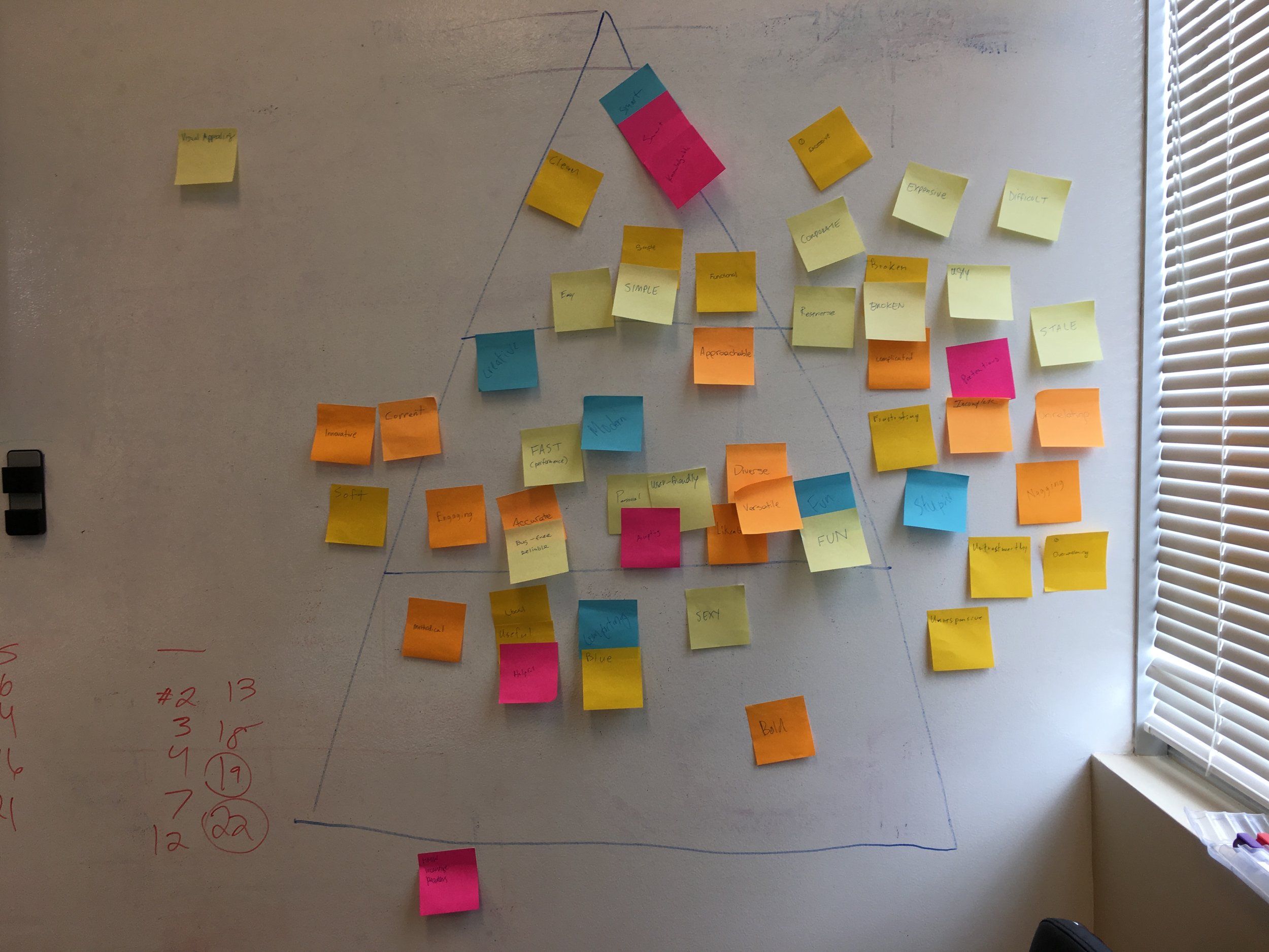
Employees were tasked with listing as many words as possible that they felt defined what (the ideal) Bookshout was. These words applied could apply to how a user interacts with the app, the visual language, or the business model its self. Once we had a plethora of sticky-notes, we started grouping and prioritizing the words until 7 were left: clean, easy, simple, creative, knowledgable, modern, approachable, and smart.
Competitor Analysis
In advance of our meeting I gathered screenshots of competitors along with their mission statements and key features. We discussed as a group what made them successful and how we wanted to be viewed in relation / against.
20 Second Gut Check
Next, I need to start forming a concept of the visual language and how it would be influenced not only by the words we just chose, but would also stand out against our competitors, and would align with our top user groups: Leadership/influencers and casual readers. In other words, it needed to be sophisticated and appealing to a corporate group, while not being pretentious but instead would be incredibly approachable for our casual reader audience. In order to accomplish that, we did the 20 second gut check exercise which flashed 15 landing page designs on the screen, for 20 seconds each. Each person then recorded their initial gut reaction and some light notes for each design while keeping in mind everything we had determined up until this point.
How Might We
Lastly we finished with the “How Might We” exercise. The goal of the exercise is to reframe problems as opportunities. I challenged the group not to come up with solutions, rather present a problem, key features, pain points, and interactions we want Users to have or not have while interacting with BookShout / our platform. Examples: HMW encourage a User to read more daily? HMW show additional books that are more relevant to the content a User is currently reading? Once everyone had a chance to write down their thoughts, we prioritize the list. This list was crucial to defining and prioritizing my next steps at BookShout.
User Prioritization Exercise
Microscope Exercise
Look and Feel Redesign
Color palette update
BookShout’s initial brand color was a flat blue color. Given the emphasis of words like clean and modern and group attraction to bolder colors in contrast to large amounts of white-space, I knew the color needed a refresh. So I took the foundational blue and brightened it up a bit and began working on color schemes that on one side of the spectrum included the new color but kept the same monochromatic color usage, while on the other end pushing the brand to include multiple bright base colors. These were presented to the Stakeholders, CEO and VP of marketing, and we came to conclude that a light touch of the more extreme color usage would be perfect foundation for the BookShout facelift.
Monochromatic options
Multiple color options
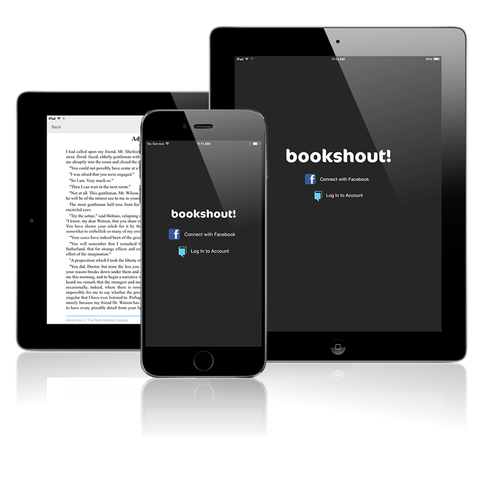
Final brand color update
Component Guide
Once the color and typography updates were finalized (replaced Helvetica with Railway and Lato), I began redoing major component elements to align with our new vision. The output of this was a component guide in Zeplin. This included everything from H1s, button styles, error handling, and navigation updates. A front-end dev then began building this out natively, so that if multiple developers were to work on different products, there would be a cohesive library to work from.
Portion of the component guide with rules on functionality
iOS App Redesign
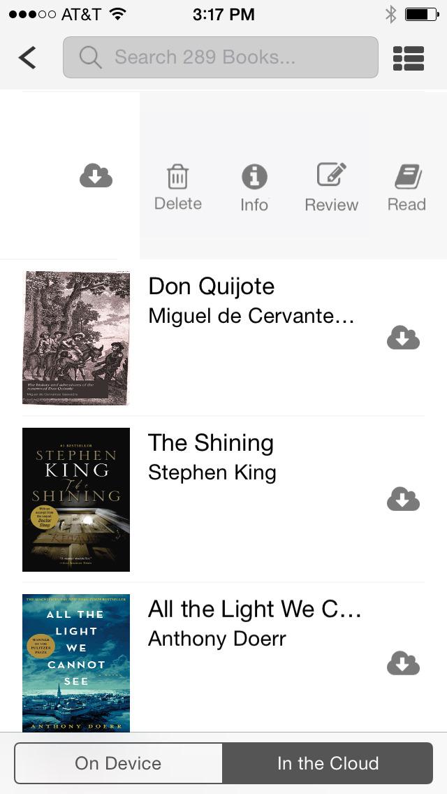
Old Designs
The elements were in place and the entire company was on board with the new visual design vision, it was now time to start the overhaul. Based on earlier findings, I decided to begin with our most out-dated but technically interesting piece, the BookShout iOS app.
Key Problems:
Multiple and confusing navigation. Both iOS and Android navigation patterns were ignored.
Lacked personality and and out-dated design
UX issues buried important interactions and caused lots of Customer complaints, in particular the Sign in experience
No app flow
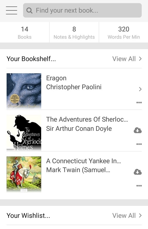
No true main app page/bookshelf with a User's books
Key Solutions
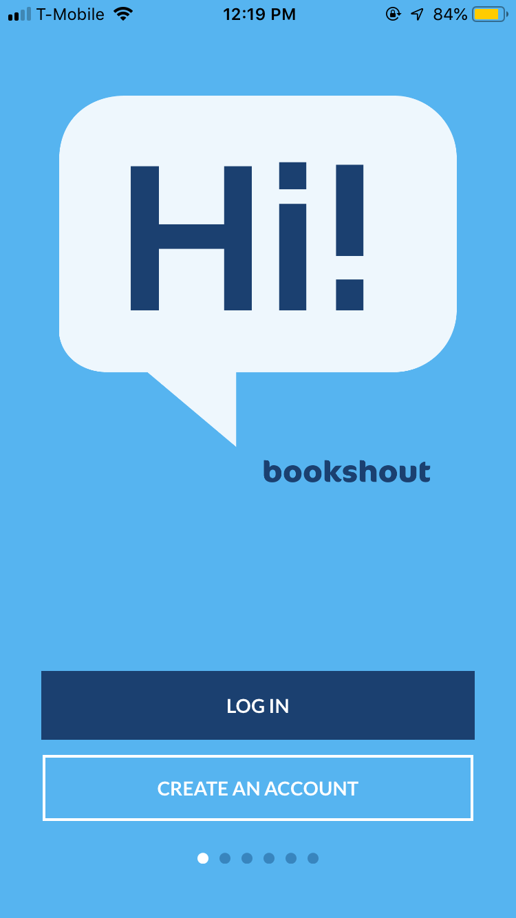
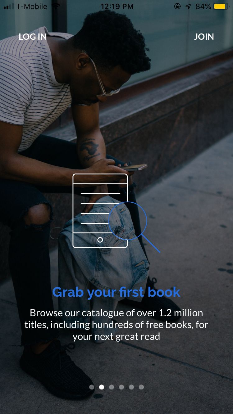
Added a required app flow before the creation of a BookShout account. This oriented users to the app and features up front. It was also a chance for the marketing team to highlight key reasons why BookShout was and is the best ereader on the market.
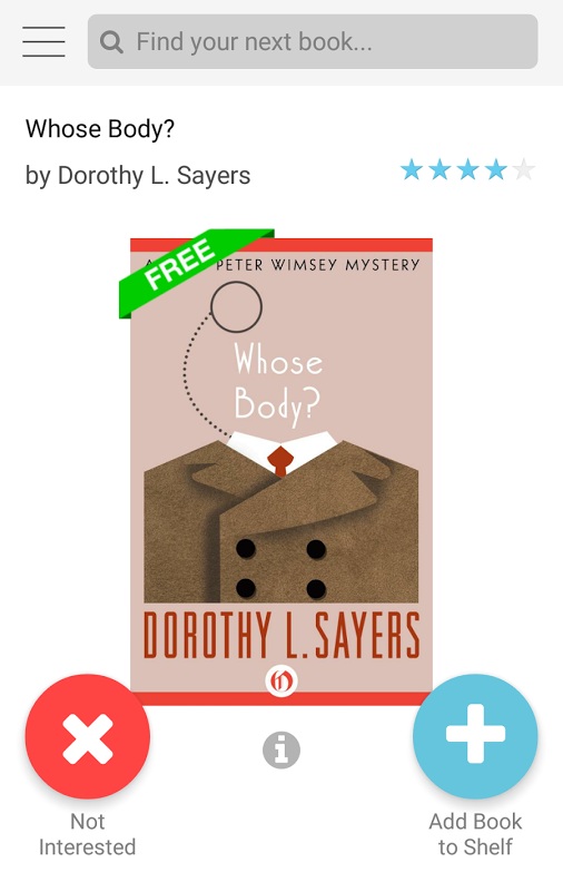
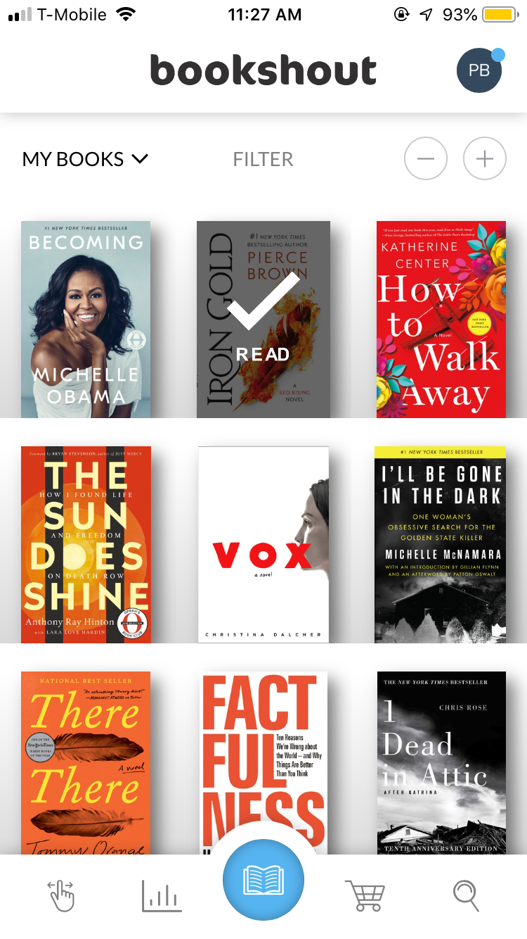
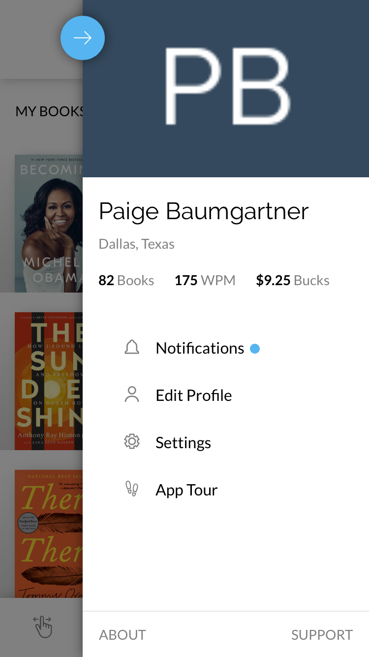
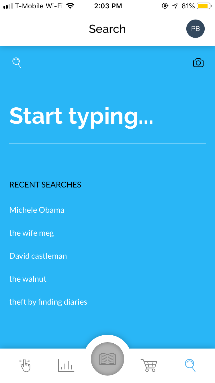
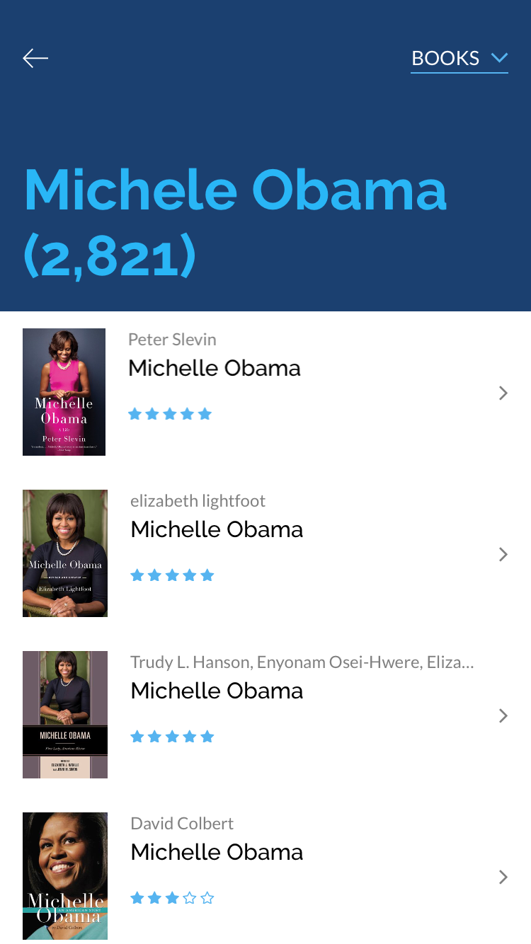
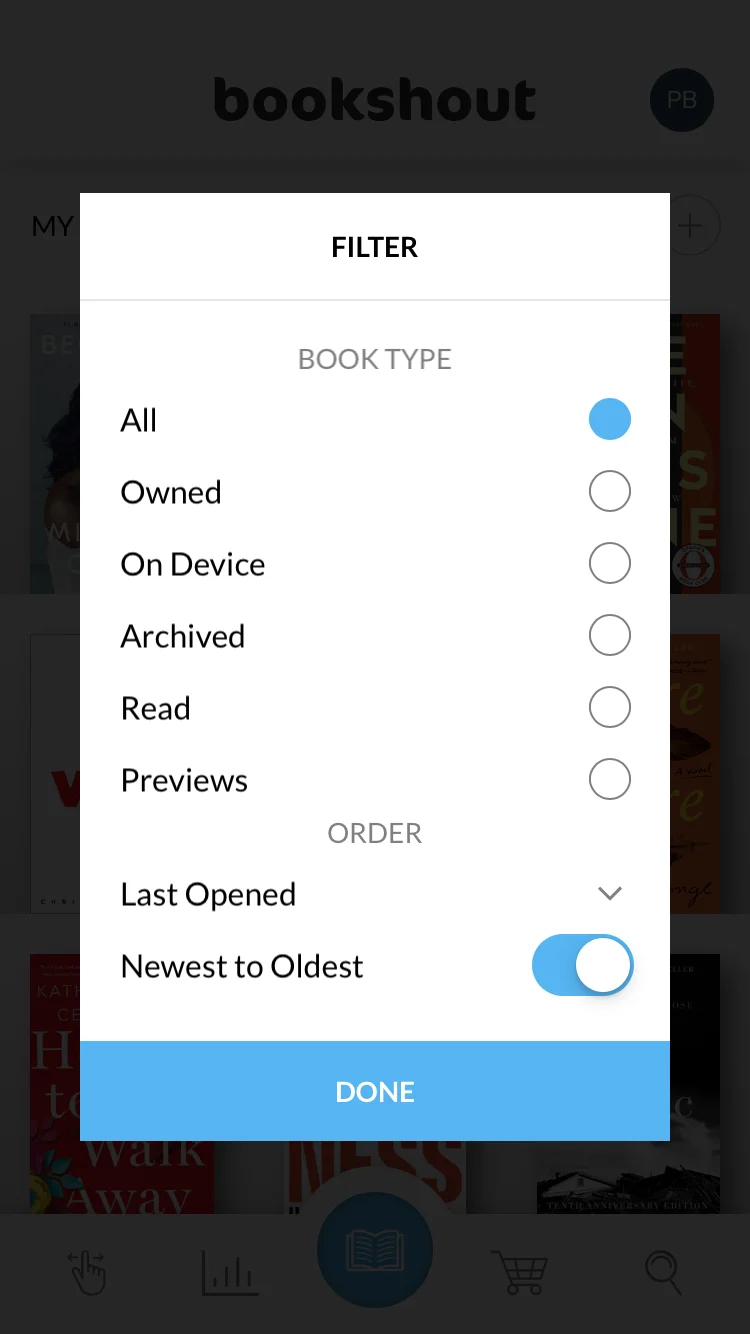
Added a bottom bar navigation that pulls from Android patterns and Material but was friendly enough to be the solution for iOS as well. The bottom bar focused on the key features for a User: a book suggestion tool, reader stats page, the book store, search, and of course the addition of a “home” “Book Shelf” page.
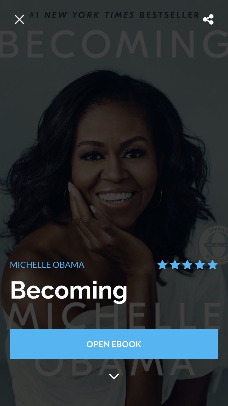
Bold user of colors, successful hierarchy of typography, and big imagery were added to bring out BookShout’s new look and feel while still using significant amounts of white space
Sign in / create an account UX update
One of the major UX issues that was addressed during the iOS redesign revolved around a User signing / creating a BookShout account. I noticed BookShout’s customer support team was receiving 20+ complaints a week related to not being able to log into their BookShout account or if they successfully created an account the books they expected to be on their shelf were not appearing.
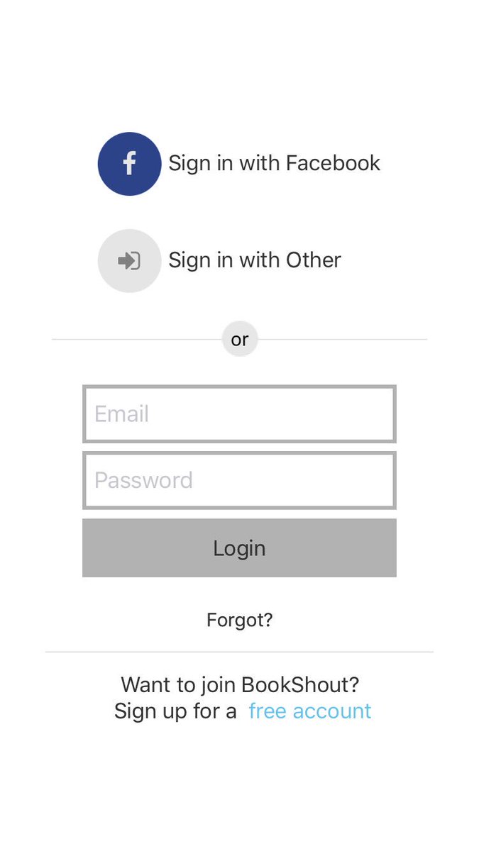
Old design
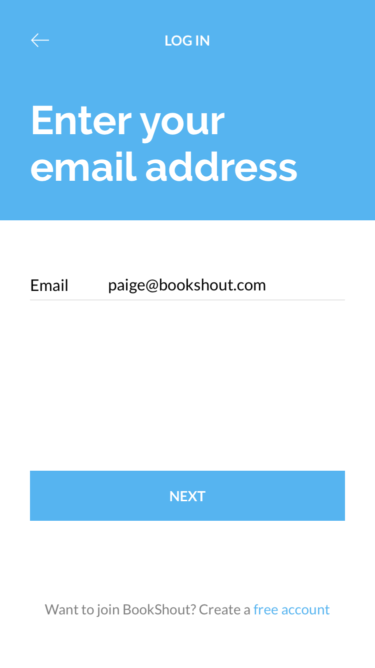
User selects “Log in” and enters their email address associated with their BookShout account.
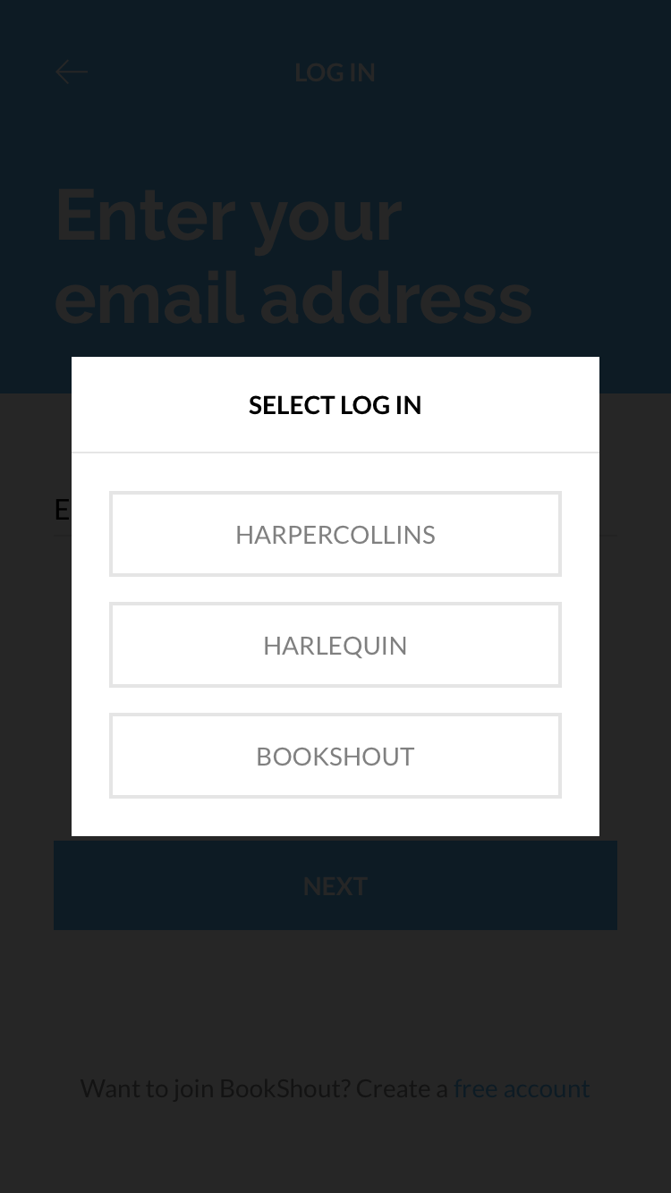
Once a valid email is entered, all available options for logging in appear; including links to 3rd party auth sign ins
If a user wishes to sign in with their BookShout email/password combination, they may do so
The Solution
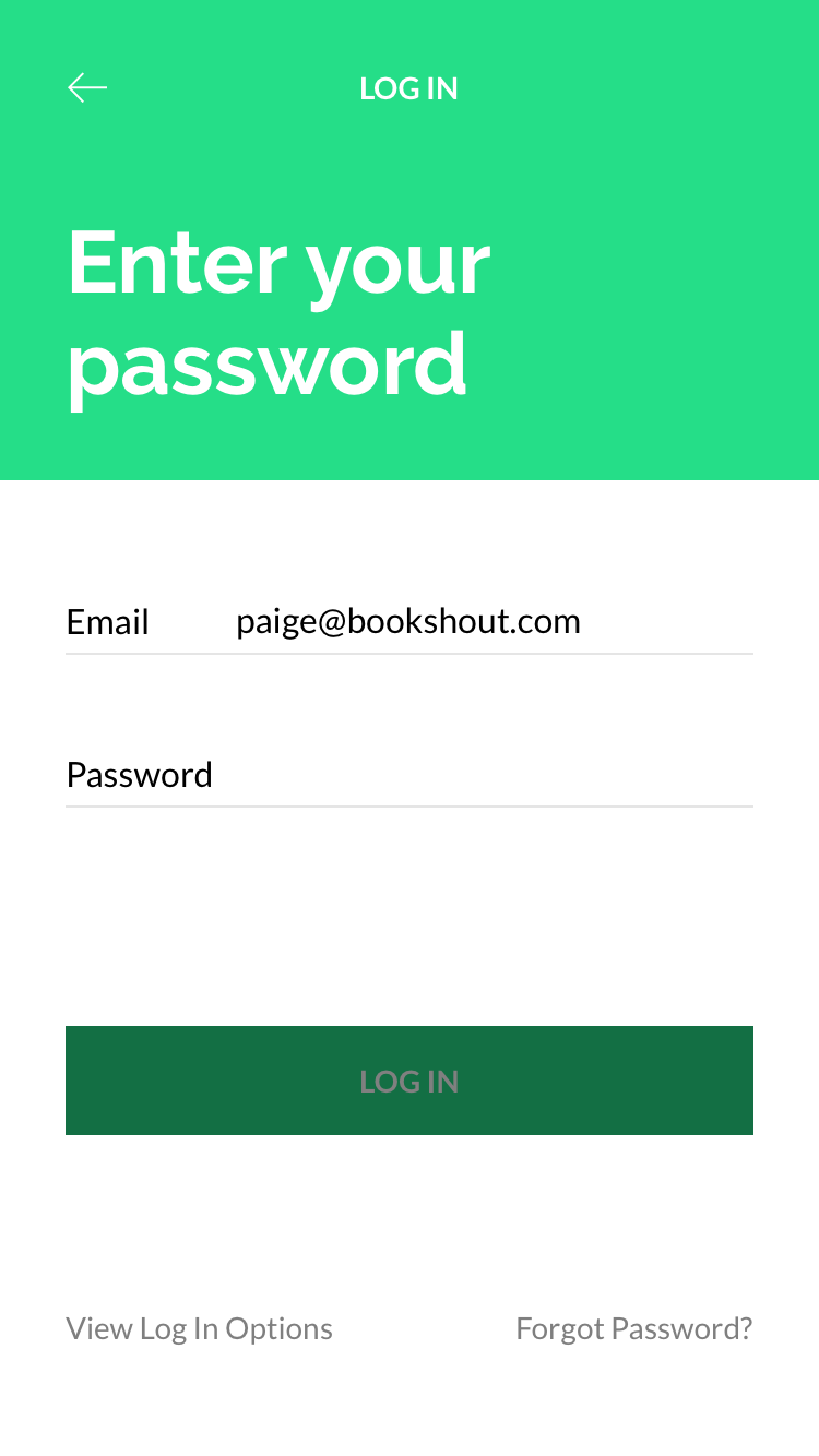
We decided to tell the User who they were instead of hoping that they know. What do I mean by that? Instead of giving a list of different options to sign in through (like a major network channel asking you to choose your network provider), we decided we would ask for the Users email, then we would provide them with the relevant sign in options. For example, if a User created their account via a email/password, then connected their Facebook to find friends, and also bought a book from HarperCollins, they would get to choose from those 3 options to log in with. Additionally, if a User tries to create a new account, instead of just telling them, “The email is already associated with an Account.” We updated our messaging to suggest how they log in based on their options: “This email is already associated with an Account. Have you tried signing in with HarperCollins.”
The Problem
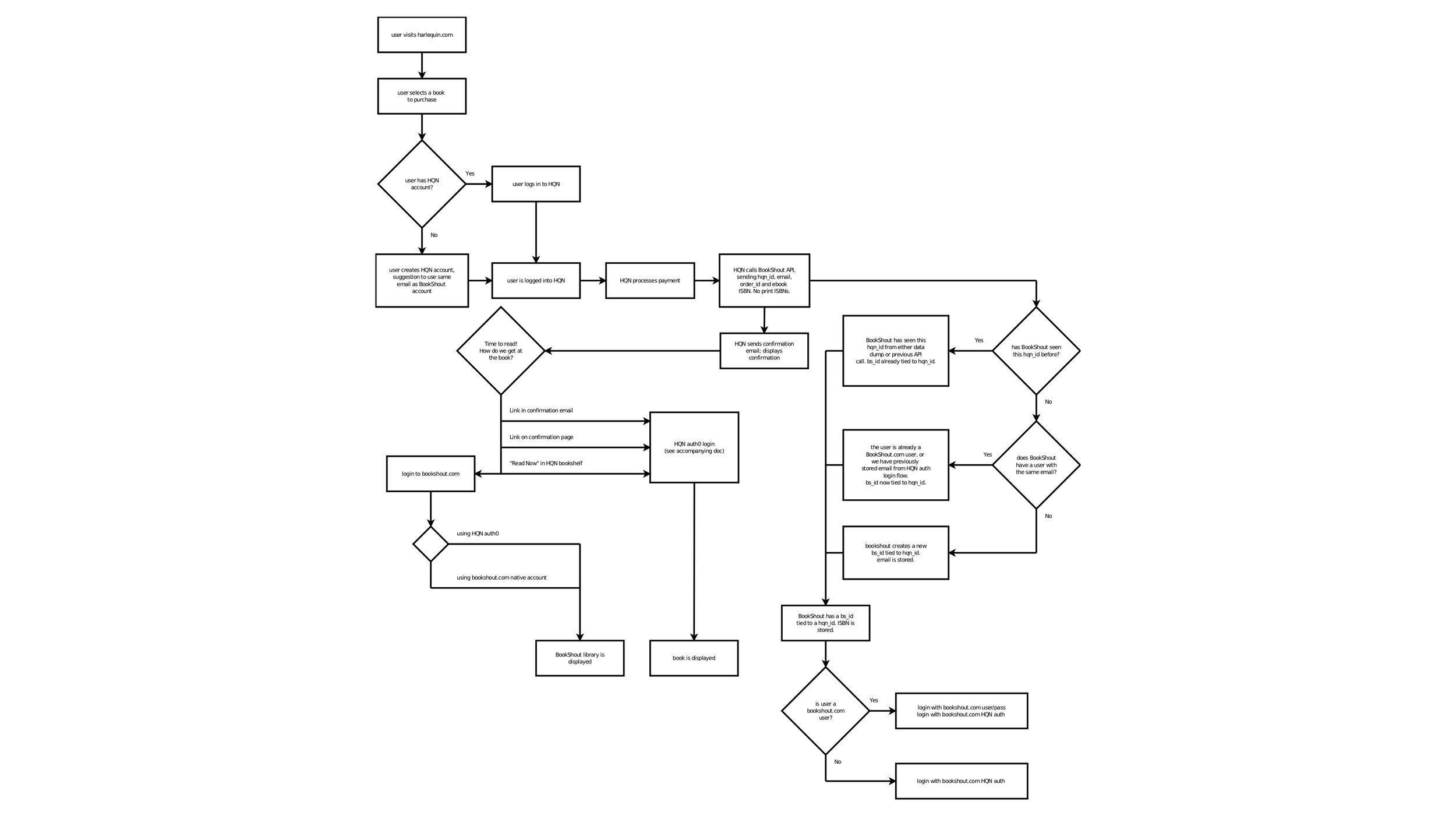
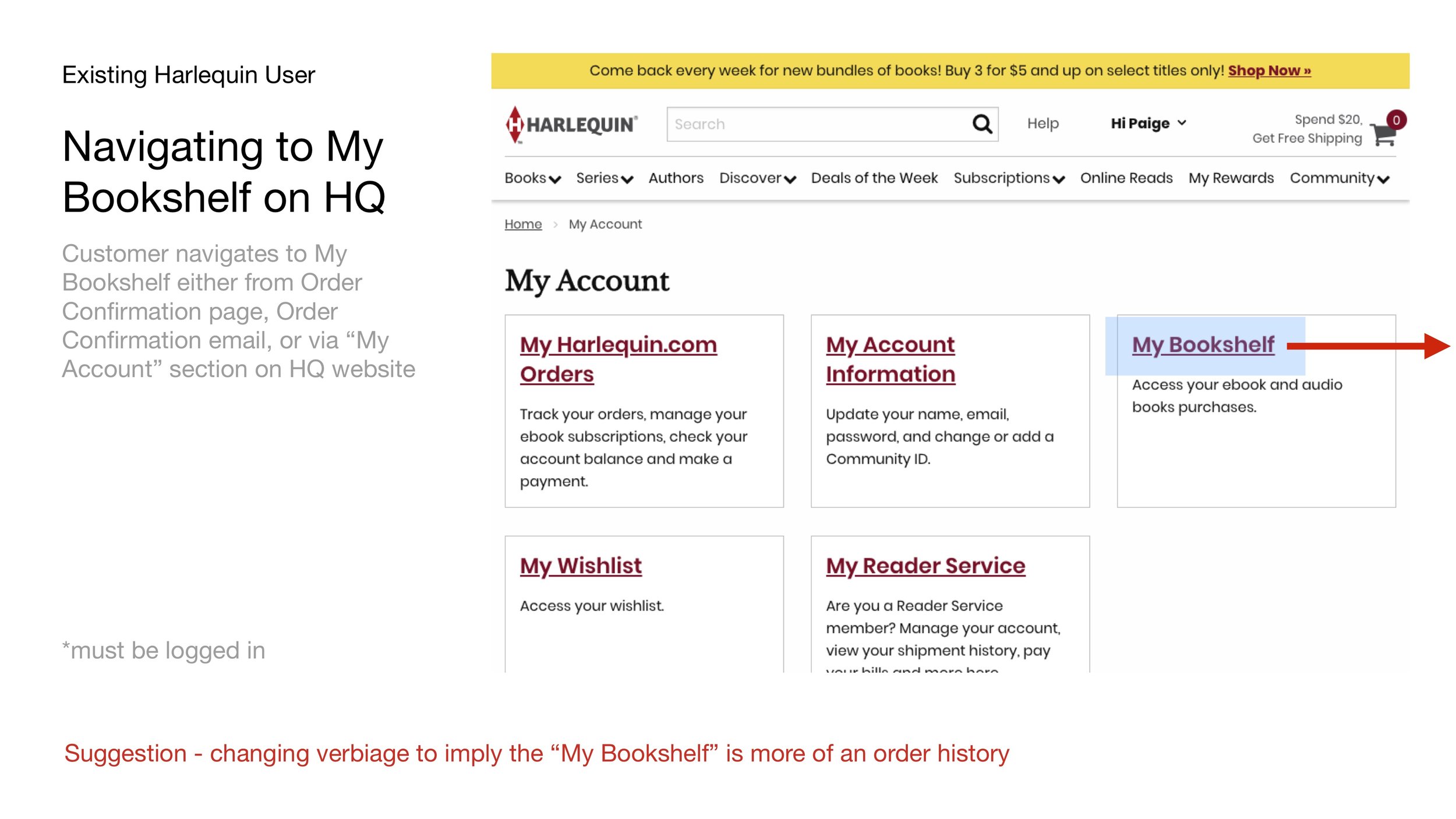
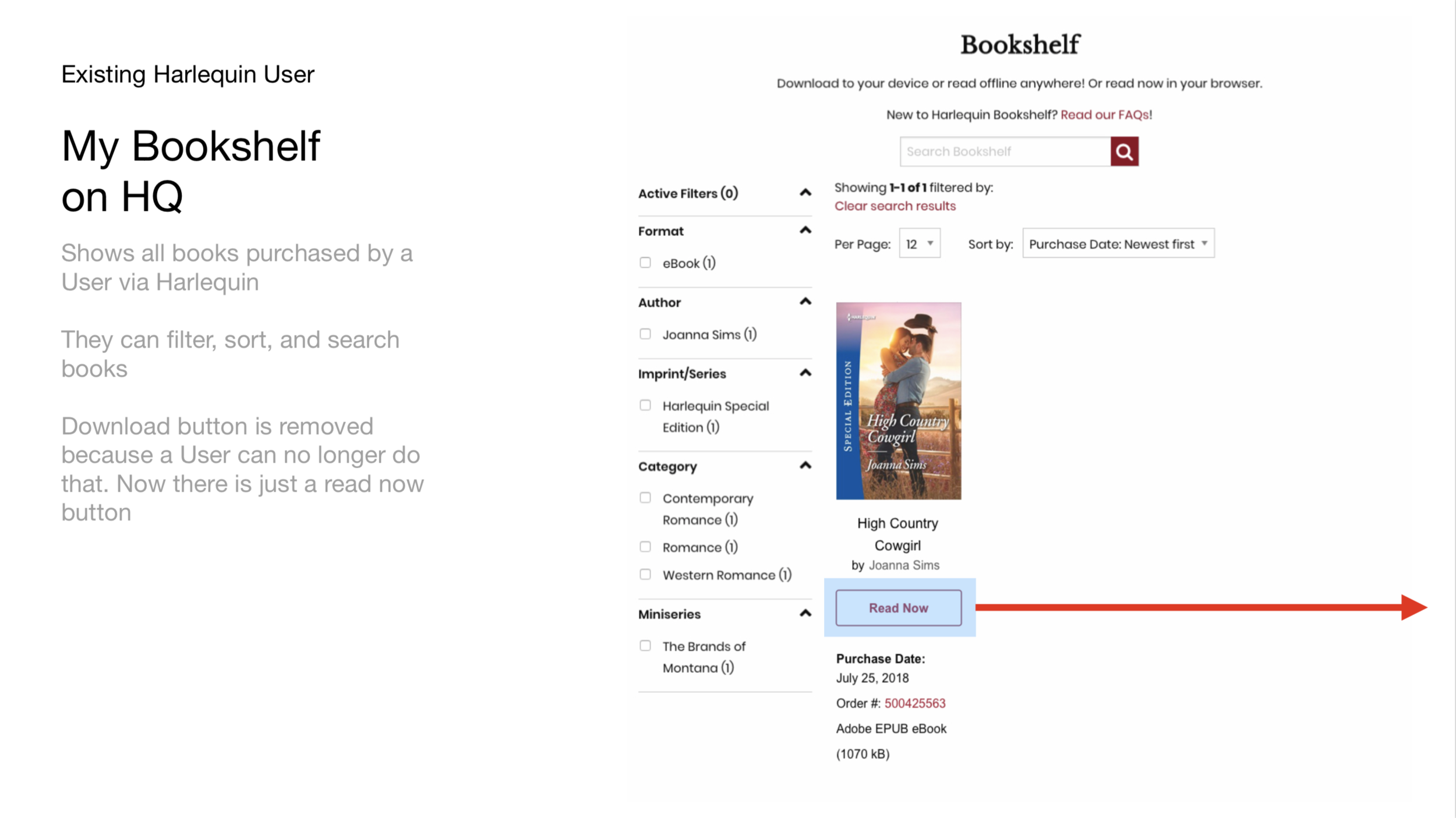
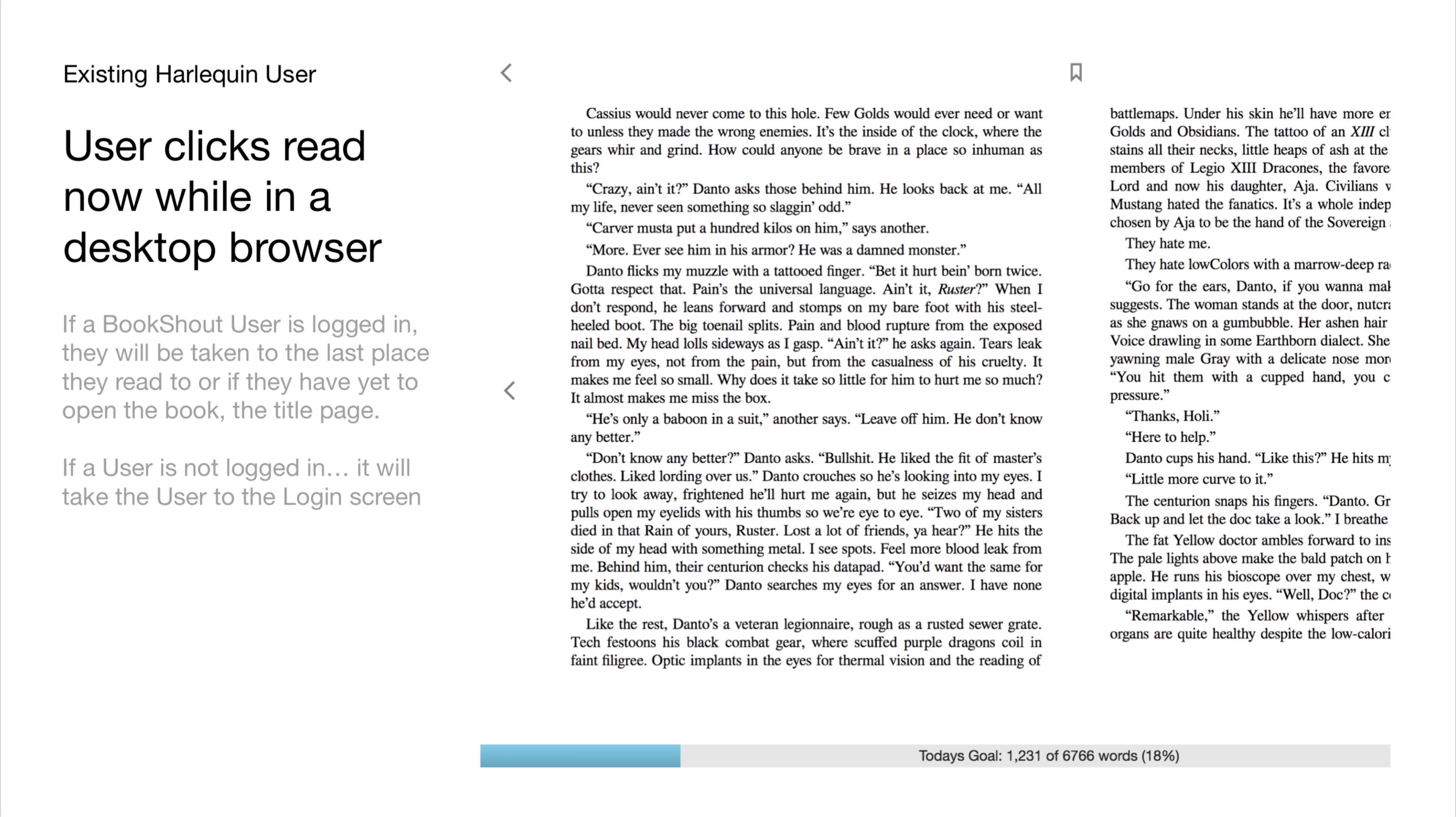
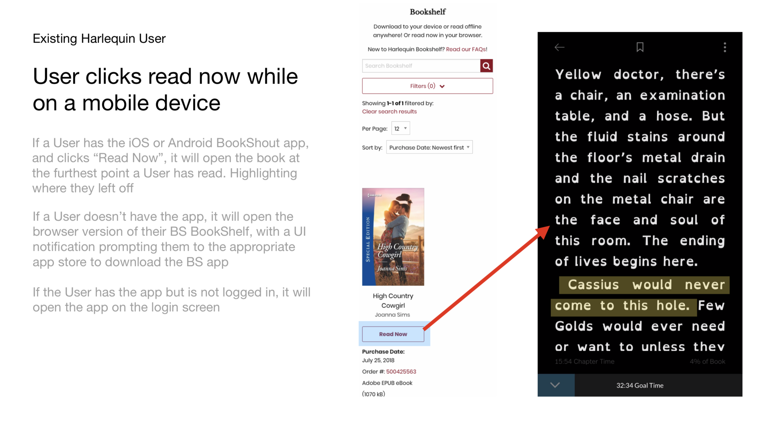
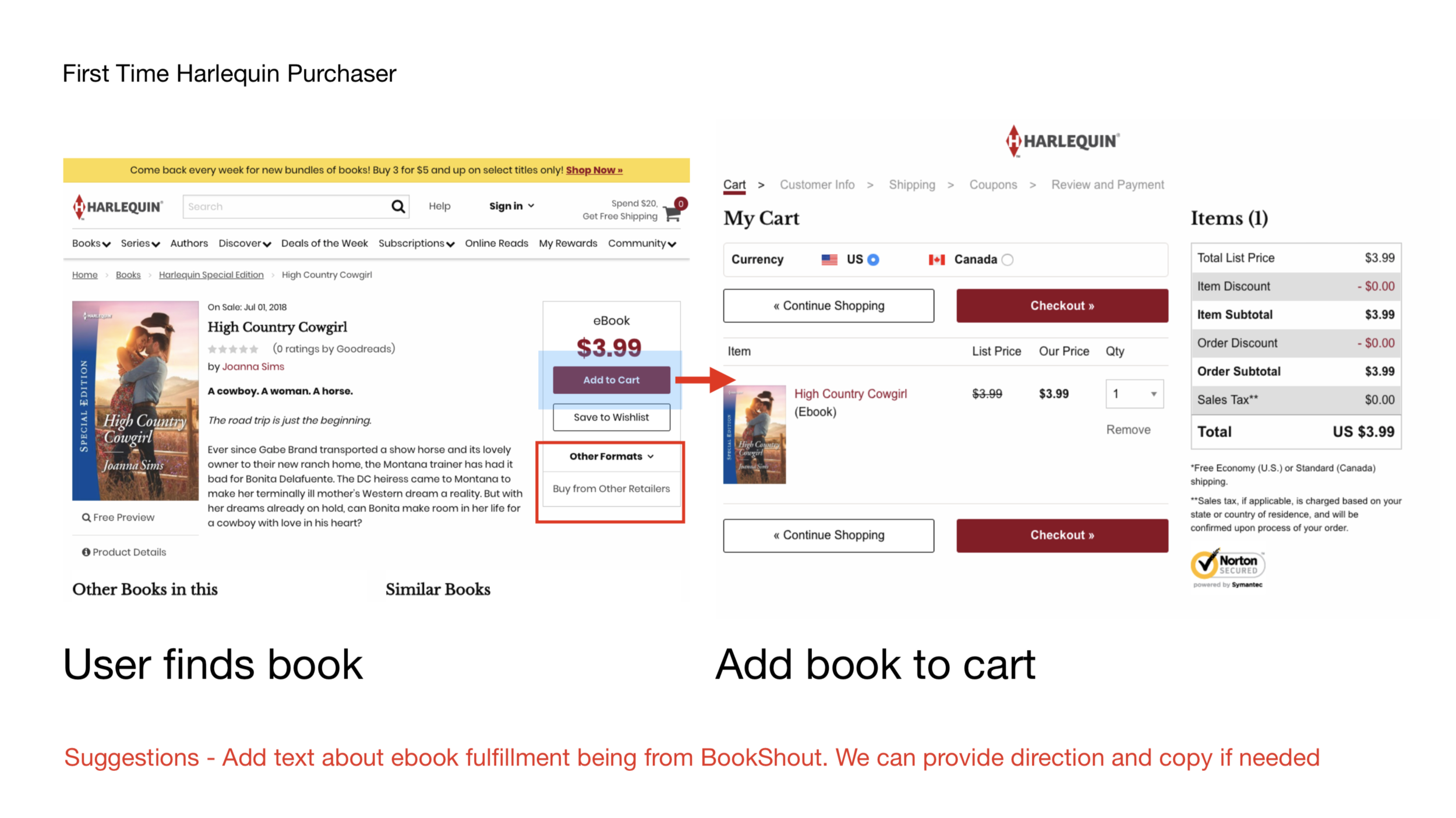
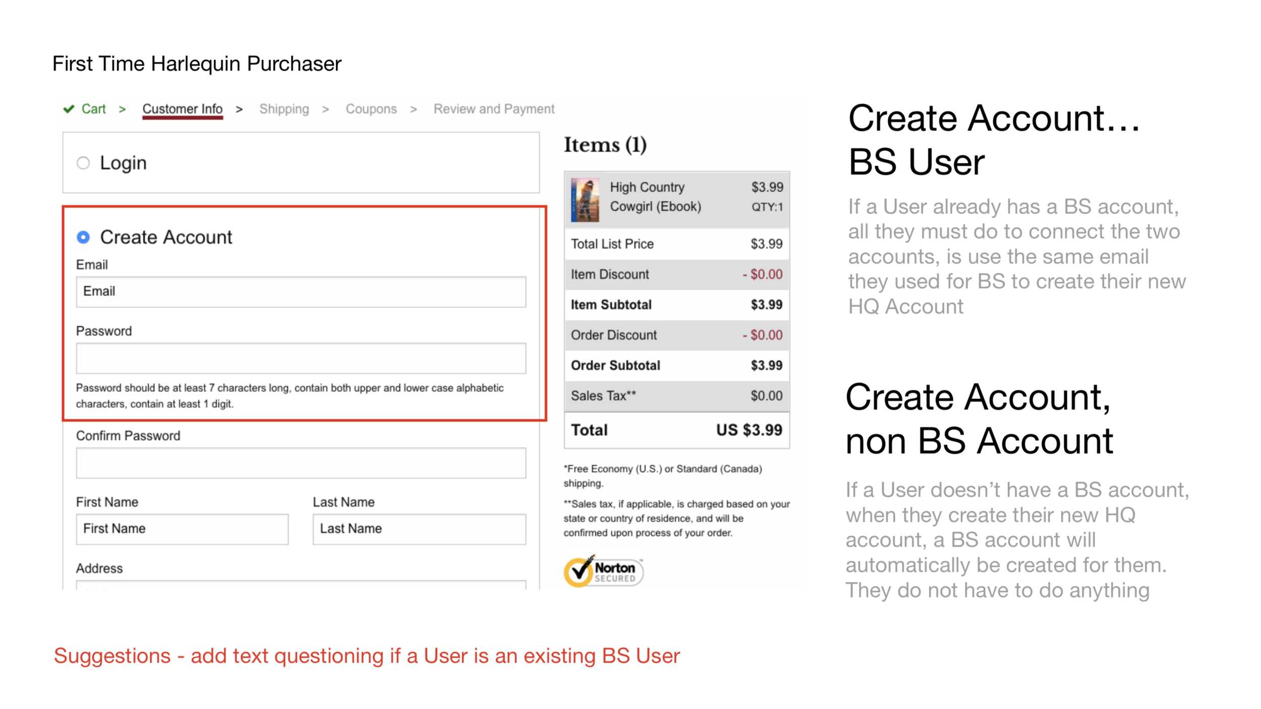
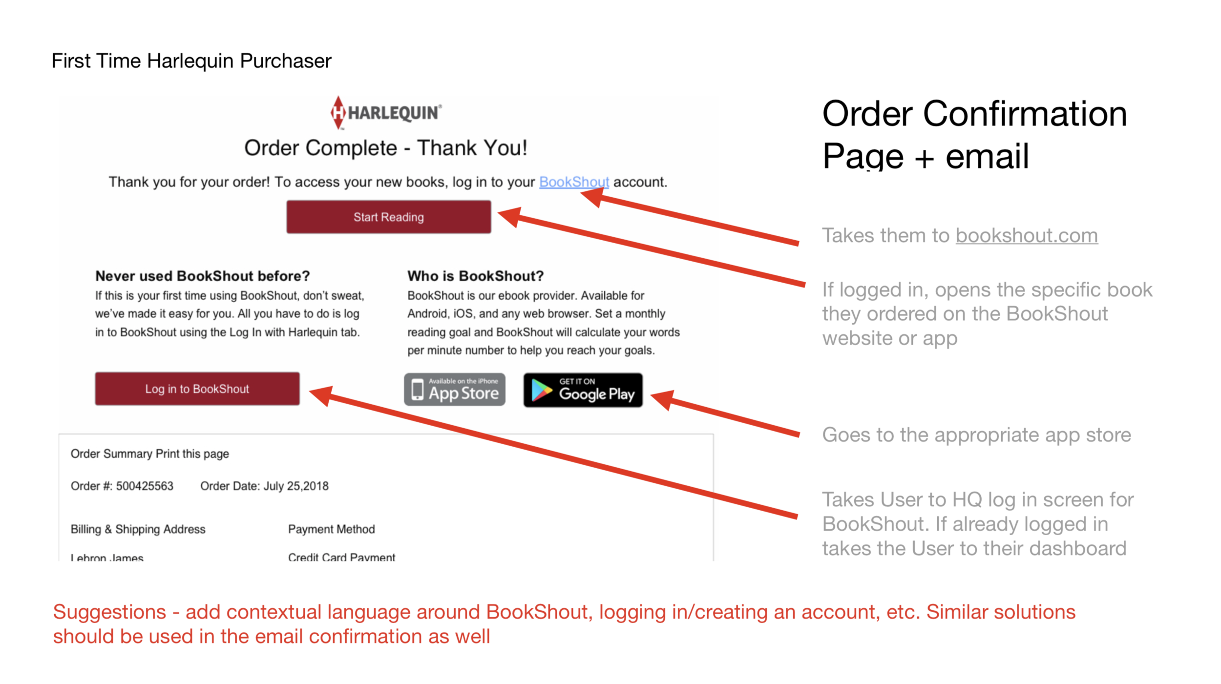
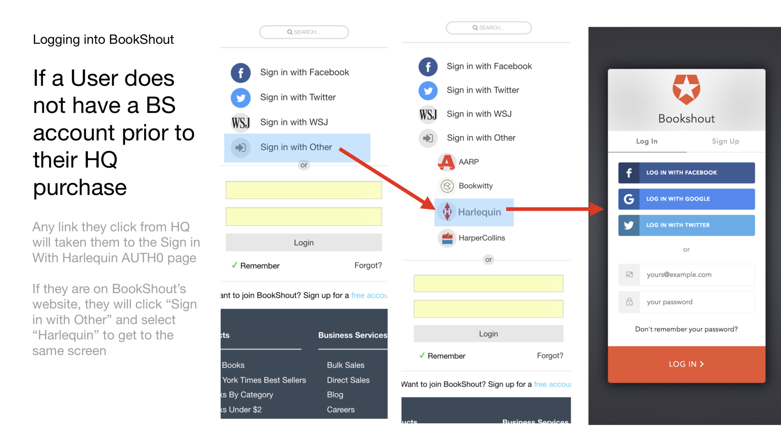
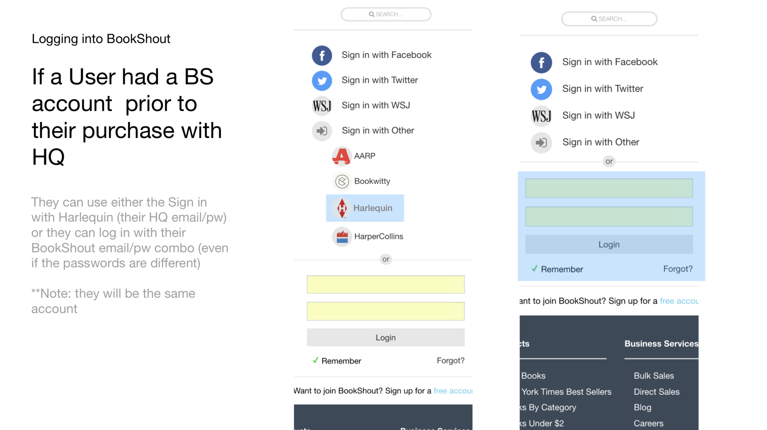
BookShout partners with companies to fulfill ebooks, for example we fulfill all ebook purchases made for HarperCollins. Users of HarperCollins and other similar clients, have accounts generated automatically for them when they make a purchase and then simply sign in via the clients own auth systems listed on the BookShout app. This means a user has multiple options of signing in/creating an account: Facebook, a native email/password combination, a publisher, or a client such as The Wall Street Journal. Users didn’t know how to sign in a second, third, fourth time because they weren’t associated themselves with their previous account and the client that generated the account for them. To add to the confusion, we also buried those 3rd party sign ins under a section called, “Sign in with Other”. Not only did it not look like a button, User didn’t realize they were apart of the “Other” category. Additionally, many users were creating duplicate accounts.
B2C and B2B Landing Page Website Updates
Old Design
BookShout’s landing page for their consumer site spent equal amounts talking about the B2C side of the company as well as the business portion.
Wireframes
Final design and site map
Example bug fixing and CSS changes
Example bug fixing and CSS changes
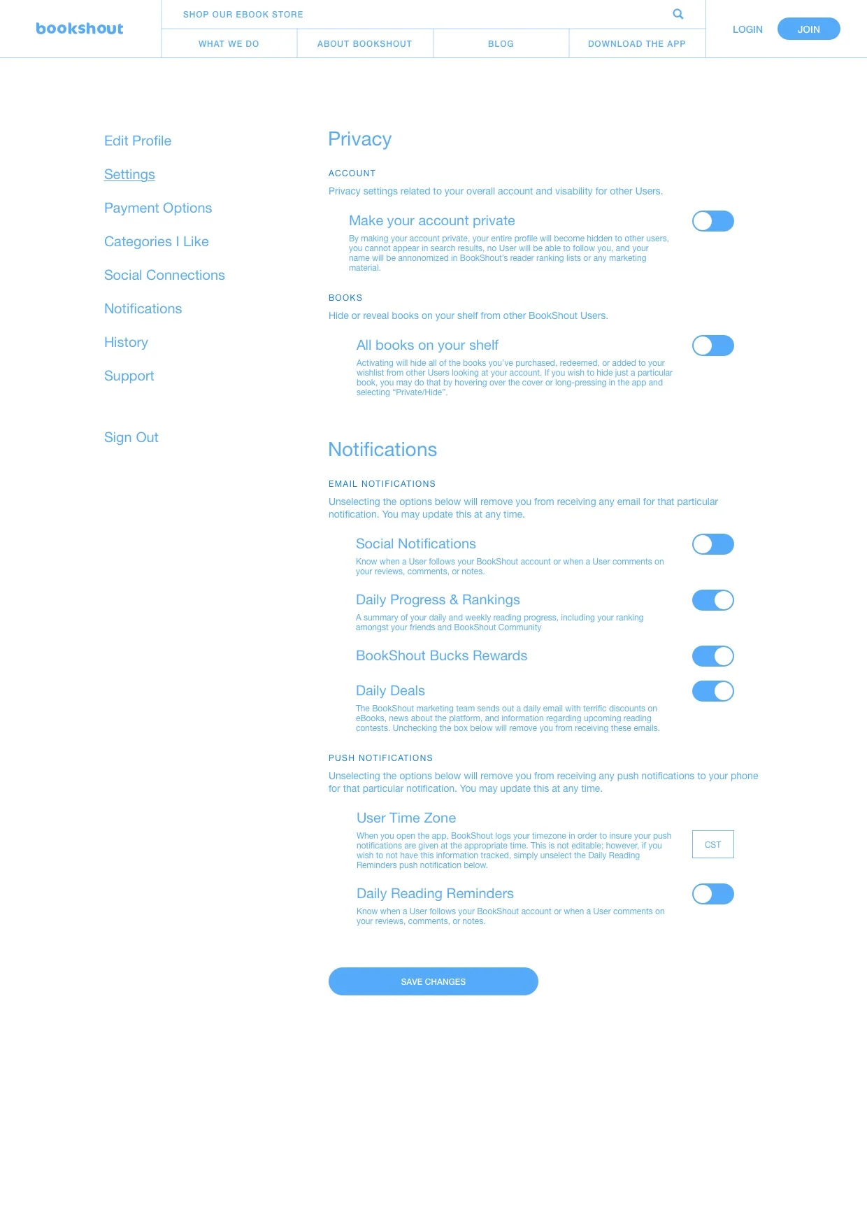
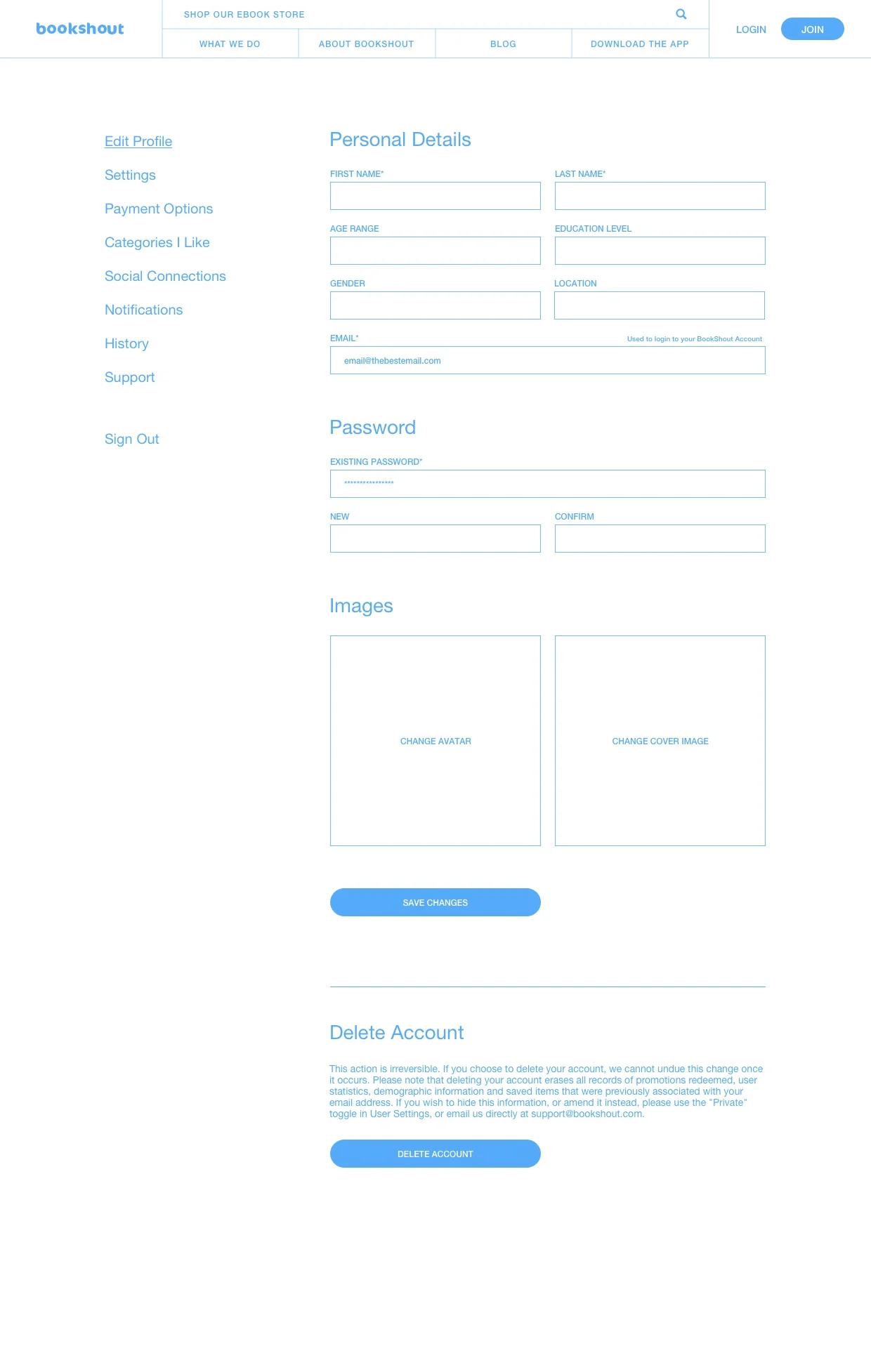
Example Wireframes
Wireframe for log in
Final design for BookShout log in
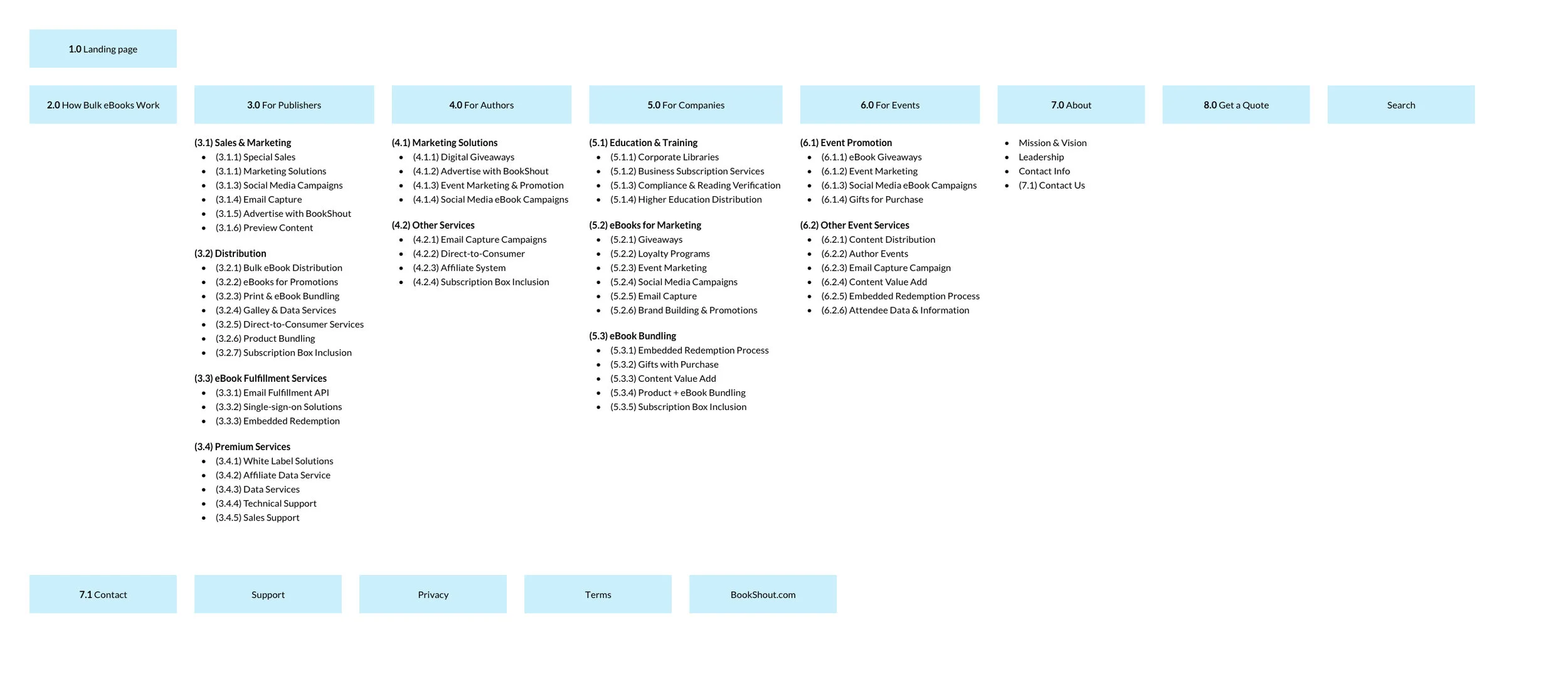
Example site map creations
Example site mapping for all products
Example site map
Updated Collateral
Video creation
Storyboarded, wrote copy, and worked with a company to produce a video about a new service I helped create for BookShout with our CEO
New case study assets
Client integrations / architecture
